
Customization
PartnerPortal is built to feel like an extension of your own brand. You can shape the colors, fonts, logos, and overall look partners see throughout the portal, so the experience feels like yours from the very first sign-in.
Open it from Portal Setup -> Customization.
The screen is organized around five parts:
- Portal Preview
- Colors
- Fonts
- Logos
- Customize Menu & Screens — the menu, the partner dashboard, the partner screen and the lead screen, each in its own section of one card
Portal Preview
Section titled “Portal Preview”The preview lets you see your branding choices in context before you save them.
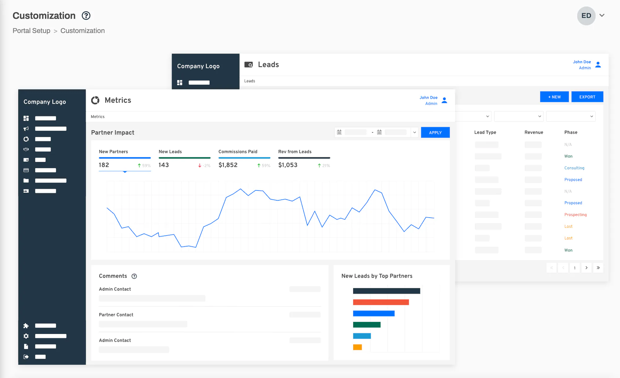
Use it to check:
- sidebar contrast
- button colors
- how your brand and action colors work together
- whether the portal still feels clear and readable
Colors
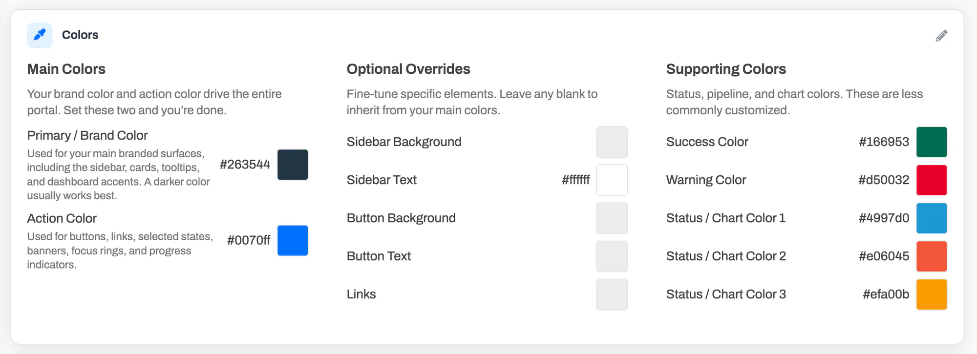
Section titled “Colors”The color editor is designed to give you a strong branded look without forcing you to over-customize every detail. For many portals, the main colors are enough. The additional controls are there when you want a more tailored look.
Main Colors
Section titled “Main Colors”These are the two settings that do most of the visual work:
- Primary / Brand Color for major branded surfaces such as the sidebar and broader portal chrome
- Action Color for buttons, links, selected states, banners, focus rings, and progress-style accents
If you only plan to update two settings, start here.
Optional Overrides
Section titled “Optional Overrides”Optional overrides let you fine-tune specific parts of the interface without changing the overall look of the portal.
You can currently override:
- Sidebar Background
- Sidebar Text
- Button Background
- Button Text
- Links
Supporting Colors
Section titled “Supporting Colors”These colors support the rest of the interface, including statuses and charts:
- Success
- Warning
- Status / Chart Color 1
- Status / Chart Color 2
- Status / Chart Color 3
Change and save colors
Section titled “Change and save colors”Open Portal Setup -> Customization.
In Colors, click Edit.
Update the main colors first, then add optional overrides only where you need them.
Review the Portal Preview while you work.
Click Save.
The app can warn about color contrast, but those warnings do not block saving. That gives you room to refine your theme without being forced into one preset combination.
Fonts carry as much of your brand as colors do. The font settings let you choose the typefaces used across the entire portal, including the login screen partners see before they sign in.
There are three settings:
- Heading Font for page titles, card titles, and section headings
- Body Font for regular text, links, buttons, and tables
- Font Weight for how bold headings appear across the portal
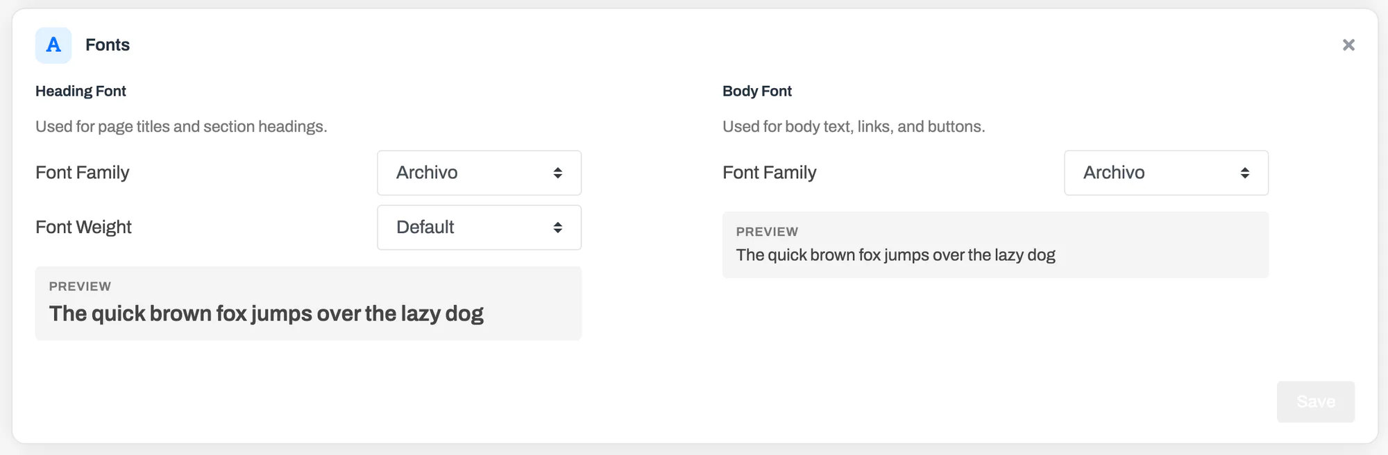
You can pick from a curated set of typefaces: Archivo (the default), Inter, Roboto, Open Sans, Lato, Montserrat, Poppins, Work Sans, and two serif options, Lora and Merriweather. Pairing a distinctive heading font with a clean body font is a simple way to give your portal a strong identity.
Each setting shows a live preview line, so you can see exactly how a font looks before you save it.
Font Weight
Section titled “Font Weight”The weight setting controls how bold headings render:
- Default keeps PartnerPortal’s standard weights, which are tuned per element — larger headings are bolder, smaller ones lighter.
- Regular (400) through Bold (700) apply one uniform weight to every heading, from page titles down to card titles and table headers. Choose this when your brand calls for a consistently lighter or heavier look.
Some fonts do not include every weight. Unavailable weights appear disabled in the picker.
Change and save fonts
Section titled “Change and save fonts”Open Portal Setup -> Customization.
In Fonts, click Edit.
Choose a heading font and a body font, and adjust the font weight if you want headings uniformly lighter or bolder.
Check the preview lines under each setting.
Click Save.
Font changes apply immediately across the portal for everyone, including on the login page. Switching back is just as easy — use the reset arrows while editing to return any setting to the default.
The logo section lets you tailor the portal to different visual contexts so your branding still looks polished across the full experience.
You can upload three logo types:
- Light on Dark for the sidebar when your sidebar background is dark
- Dark on Light for the login screen and for portals using a light custom sidebar background
- Favicon for the browser tab icon
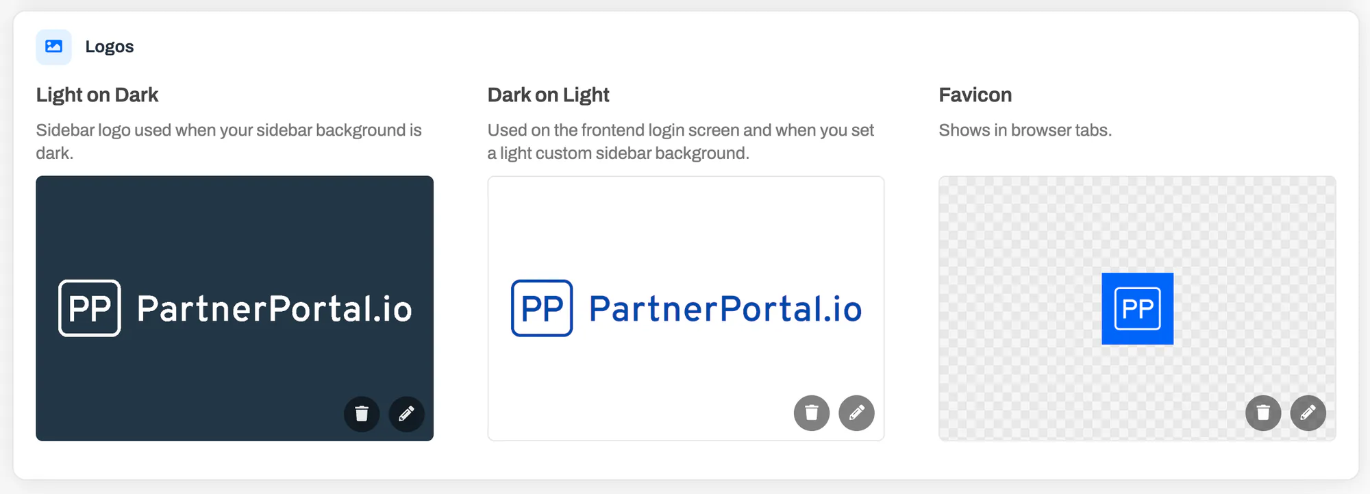
You can update each one independently and restore the default later if needed.
Upload or replace a logo
Section titled “Upload or replace a logo”Open Portal Setup -> Customization.
Scroll to Logos.
Select the logo tile you want to change.
Upload the new asset.
Repeat for the other logo variants if needed.
PartnerPortal accepts standard web image formats for logo uploads, and the exact accepted formats vary slightly by tile. The favicon tile also supports browser-icon formats.
Customize Menu and Screens
Section titled “Customize Menu and Screens”The Customize Menu & Screens card gathers everything about what people see once they are signed in: the side menu, the partner dashboard, the partner screen and the lead screen. Pick a section with the Menu, Dashboard, Partner screen and Lead screen buttons at the top of the card. Each section is described below.
These settings are your portal-wide defaults. A partner group can override any of them for its members — see Customize Menu and Screens for a Group.
Customize Menu
Section titled “Customize Menu”The Menu section lets you decide which items appear in your portal’s side navigation, so you can hide sections a portal doesn’t use and keep the menu focused on what matters. You can tailor two menus independently: the Partner menu your partners see, and the Admin menu your own team sees.
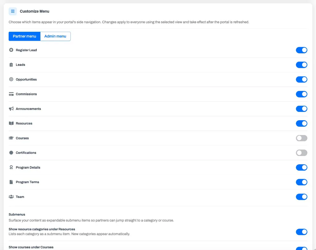
Switch between them with the Partner menu / Admin menu buttons at the top of the section. Each menu has its own set of toggles, and changes to one never affect the other.
Show or hide menu items
Section titled “Show or hide menu items”Each item in the selected menu has an on/off toggle. Turn an item off to remove it from that menu for everyone who uses it, and turn it back on to restore it.
A few essential items — Dashboard, Portal Setup, Billing, My Account, Support, and Logout — keep the portal usable and can’t be hidden, so they aren’t listed here.
Partners on the Non-commercial partner model lose the Payouts and SPIFFs items automatically, on top of whatever you set here, because no payouts are ever generated for them. See How Non-commercial Partners Work.
Partner submenus
Section titled “Partner submenus”In the Partner menu, you can also surface your content as expandable submenu items so partners can jump straight to what they need:
- Show resource categories under Resources lists each of your resource categories beneath the Resources item.
- Show courses under Courses lists each of your courses beneath the Courses item.
New categories and courses appear automatically once the matching toggle is on, so the menu stays current without any extra steps.
Change the menu
Section titled “Change the menu”Open Portal Setup -> Customization.
In Customize Menu & Screens, choose Menu, then Partner menu or Admin menu.
Toggle items on or off, and set the submenu options if you’re editing the partner menu.
Refresh the portal to see the updated navigation.
Each toggle saves on its own as soon as you flip it — there’s no separate Save step. Because the menu is built when the portal loads, your changes (and your partners’) appear after the next refresh.
Customize Dashboard
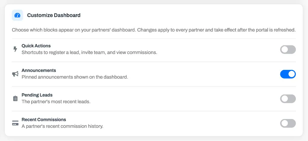
Section titled “Customize Dashboard”The Dashboard section lets you choose which blocks appear on your partners’ dashboard — the page partners land on when they sign in — so you can keep it focused on what your program actually uses.
Show or hide dashboard blocks
Section titled “Show or hide dashboard blocks”Each block has an on/off toggle. Turn one off to remove it from every partner’s dashboard, and turn it back on to restore it. You can control four blocks:
- Quick Actions — shortcuts to register a lead, invite team, and view commissions.
- Announcements — pinned announcements shown on the dashboard.
- Pending Leads — the partner’s most recent leads.
- Recent Payouts — a partner’s recent payout history.
If you hide every block, partners see a short Welcome card instead of an empty dashboard, pointing them to the menu to get started.
Change the dashboard
Section titled “Change the dashboard”Open Portal Setup -> Customization.
In Customize Menu & Screens, choose Dashboard and toggle blocks on or off.
Refresh the portal to see the updated dashboard.
Each toggle saves on its own as soon as you flip it — there’s no separate Save step. Because the dashboard is built when the portal loads, your changes appear for partners after their next refresh.
Customize Screens
Section titled “Customize Screens”The Partner screen and Lead screen sections let you choose which cards appear on the partner screen and the lead screen, so each page shows only what your program actually uses. Hide the commission cards on a portal that doesn’t pay commissions, or keep deal amounts away from partners who don’t need to see them. For individual partners or groups who are never paid, use the Non-commercial partner model instead — it hides the commission and payout cards for them and also stops payouts being generated.
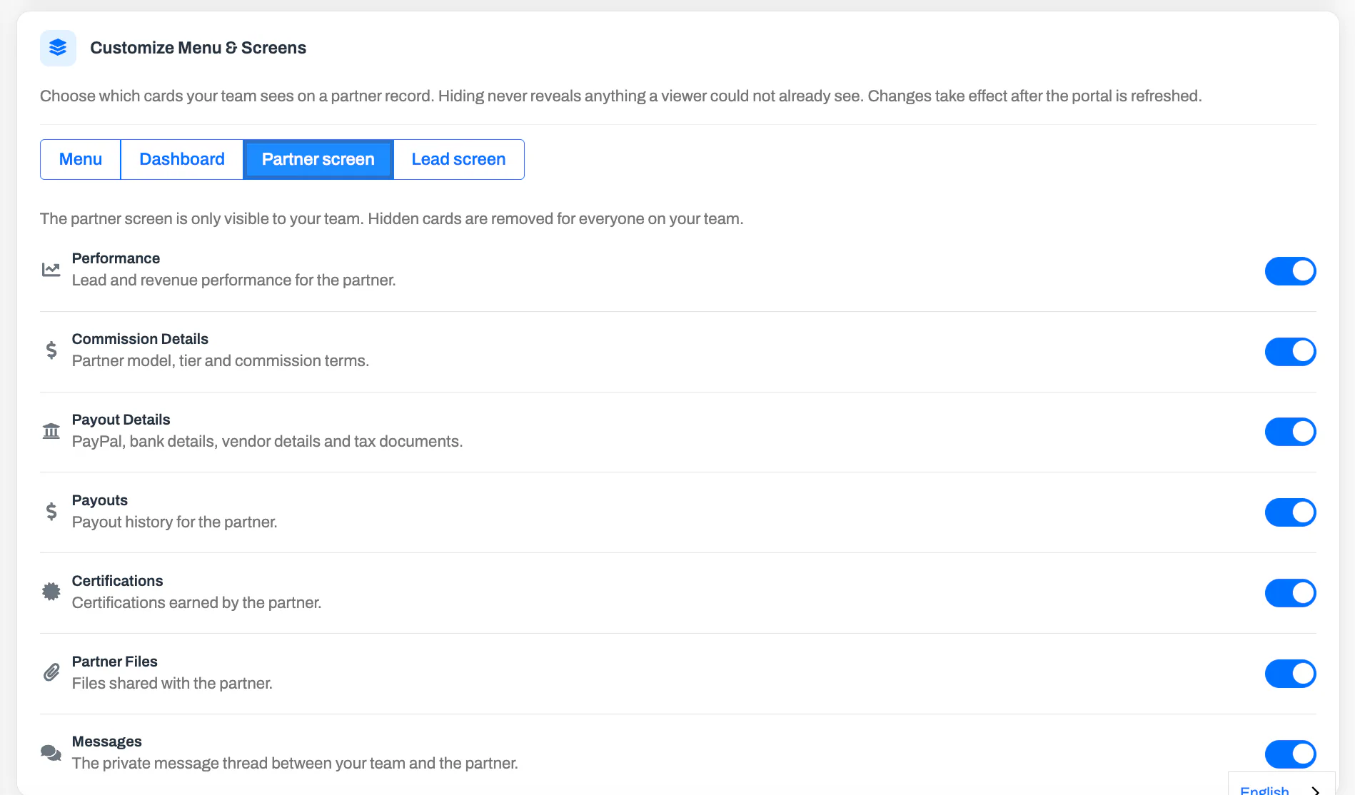
Choose Partner screen or Lead screen at the top of the card. Each screen has its own set of toggles.
Partner screen
Section titled “Partner screen”The partner screen is the partner record your team opens from Partners. Partners never see it, so hiding a card here only changes what your own team sees. You can hide:
- Performance — lead and revenue performance for the partner.
- Commission Details — partner model, tier, and commission terms.
- Payout Details — PayPal, bank details, vendor details, and tax documents.
- Payouts — payout history for the partner.
- Certifications — certifications earned by the partner.
- Partner Files — files shared with the partner.
Status, details, management, submitted leads, and partner users always stay, because your team needs them to work the partner.
Lead screen
Section titled “Lead screen”The lead screen is shared: your team and your partners open the same record. Use the Partner / Admin buttons under Viewing as to set each audience separately.
- For the Partner view, you can hide Commission settings, Payouts, Files, and Comments. When comments are hidden from partners, the comment thread becomes notes your team only sees.
- For the Admin view, you can hide Commission settings, Revenue, Payouts, and Files.
Lead status, lead details, and pipeline details always stay — they are the lead.
Sensitive fields
Section titled “Sensitive fields”Below the partner view’s cards is a Sensitive fields list for individual values you may not want partners to see. Turn off Close Value to remove the deal amount from the lead screen and the leads list for partners. Your team still sees it.
Change the screens
Section titled “Change the screens”Open Portal Setup -> Customization.
In Customize Menu & Screens, choose Partner screen or Lead screen. For the lead screen, choose Partner or Admin under Viewing as.
Toggle cards on or off.
Refresh the portal to see the updated screens.
Each toggle saves on its own as soon as you flip it — there’s no separate Save step. Changes appear after the next refresh.
These settings are your portal-wide defaults. A partner group can override them for its members — see Customize Menu and Screens for a Group.